Color Theory Sample: White, Burgundy, and Chartreuse
I like the color composition of white, burgundy, and chartreuse together.

I love chartreuse. It is named because the color resembles the French liqueur. Chartreuse is a yellow green color that sits between yellow and green in the color wheel.
And what's the difference between maroon and burgundy? Maroon is made by adding brown to red whereas burgundy is made by adding purple to red. Burgundy is cool, Maroon is warm. Maroon takes its name from the French word marron, or chestnut. The color burgundy takes its name from the Burgundy wine in France. Burgundy is similar to the colors Bordeaux, Merlot, Berry, and Redberry.

Above: The color wheel. Color is defined as the visual response of the eye to reflected rays of light. The names of colors are hues. A fully saturated hue is color of the highest chroma or intensity, with no black, white or gray.
Color, form, line, and texture comprise the elements of design. They are the physical characteristics of materials used in floral compositions. A designer must study the properties of each element in order to successfully combine them with the principles of design. This combination is the foundation of floral design.
Color - To many, color is the most important element of floral design. Sir Isaac Newton discovered the first theory of color. He recognized the colors red, orange, yellow, green, blue, and violet. By blending the spectrum into a circle, he developed the color wheel. Color is a vital part of the world. It is seen in the sky, water, flowers, and foliage of nature. Human response to color may be happy or sad. Color affects the feelings of each individual differently. Light is necessary to see color. Color is light. Every color in the spectrum can be found in daylight. When an object reflects all colors, we see the object as white. If the object absorbs all the colors, we see the object as black.
To understand and achieve success in design, a floral designer (and any type of designer, really) must be familiar with the color wheel. The pigment theory divides the color wheel into warm and cool colors. The warm colors are red, orange, and yellow. The cool colors are green, blue, and violet. The warm colors are called advancing colors and require less light to be seen. These are important factors to remember when creating floral designs. A sample color wheel is provided above for reference.
Why do chartreuse and burgundy look good together? Because burgundy has more of a red tone and chartreuse has somewhat of a green tone. Red and green are complimentary colors on the color wheel. When you’re pairing colors, one way you can find harmony is through choosing complementary colors. In this case, opposites attract. This particular color scheme draws from two colors on the opposite side of the color wheel. When you do this, the result is a high-contrast color combo that’s bright and that pops.
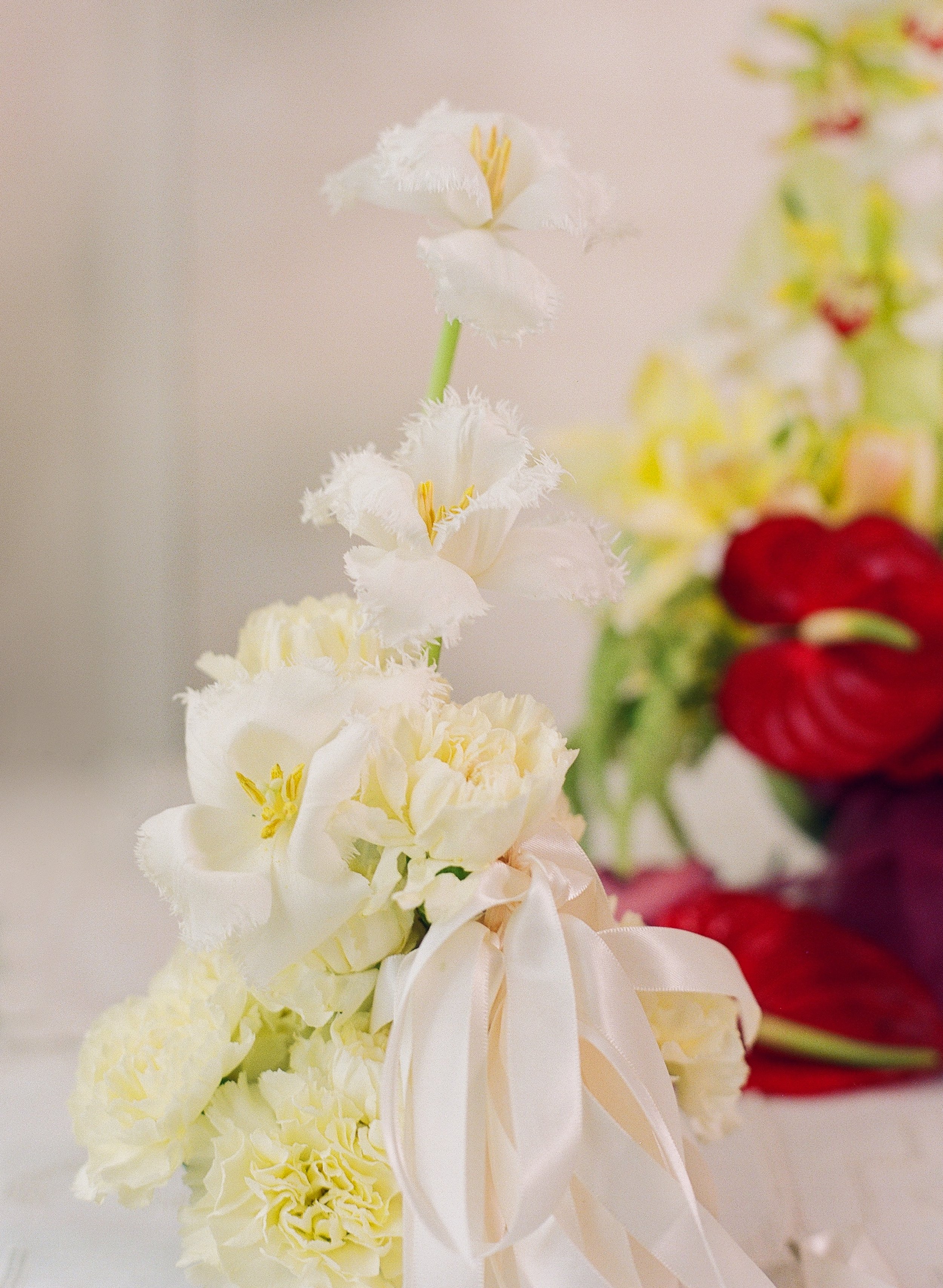


Burgundy's richness and cool undertones help calm down chartreuse's energy. Burgundy and chartreuse might be on two different sides of the color wheel, but when they're paired together, they shine. The key? Breaking up these two power hues with a white color.


Flower recipe: Tulips, orchids, lisianthus, carnations, roses, a anthurium, ribbon, thread.